Corporate Design
Digital Design
Design Guidelines
Icons & Illustrations
New brand appearance for Otto International, a worldwide procurement and trading service provider in the field of textile, shoe, and home accessories. As part of the Otto Group, the company has not only opened up to customers outside the group, but has also gradually made sustainability in sourcing a central pillar of the company.
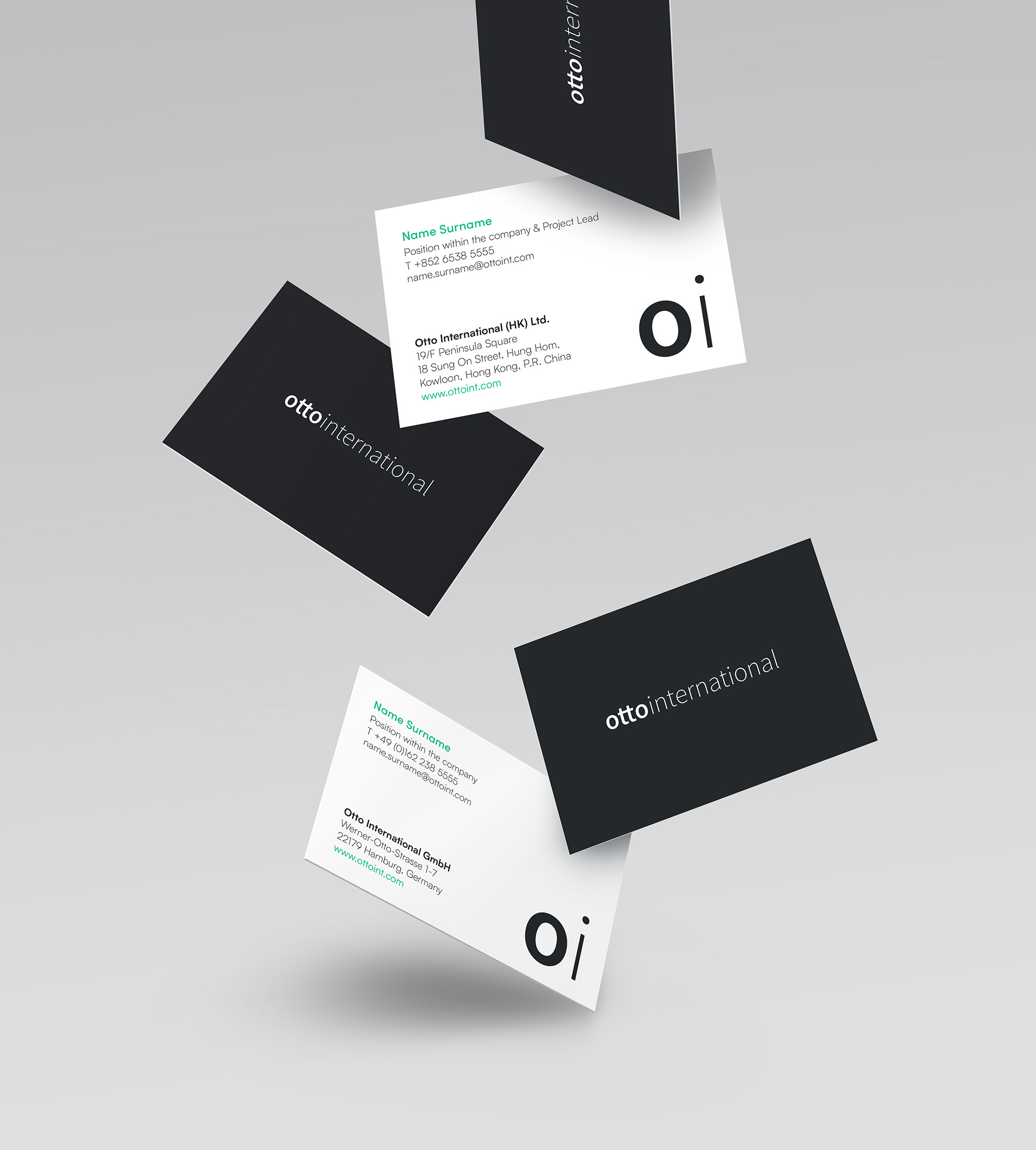
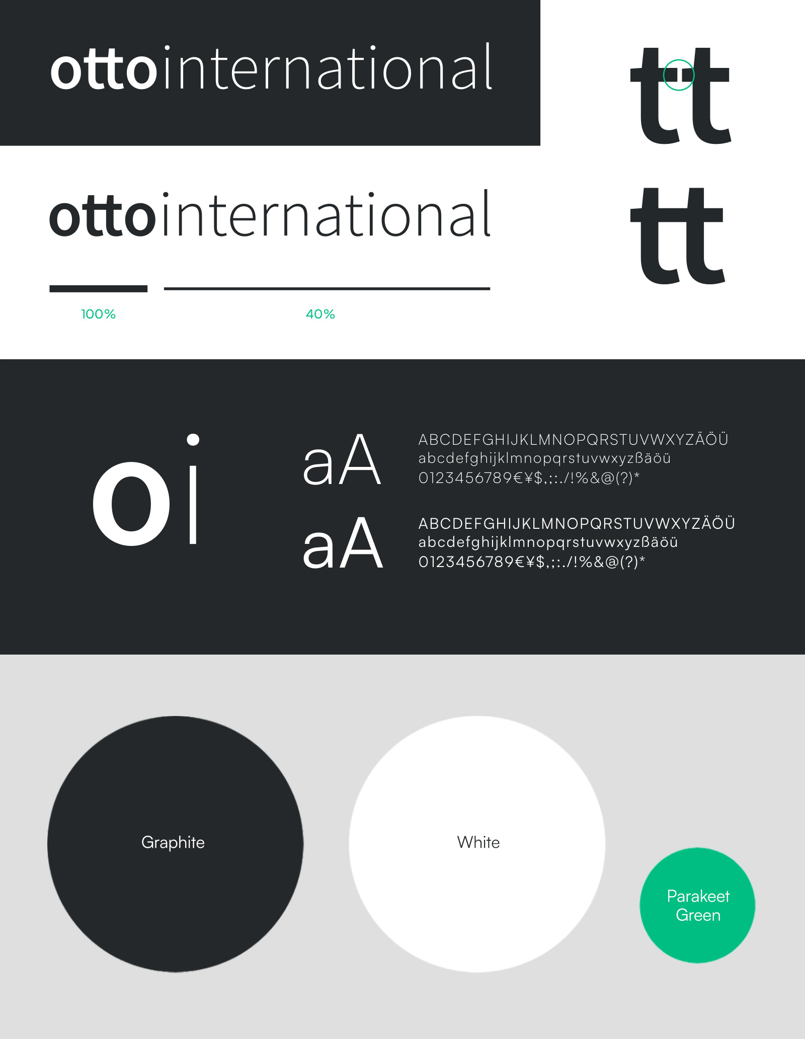
The focus of our work was the development of a clear and unobtrusive visual identity. The new wordmark is simple but straightforward. Lowercase letters and the connection of the two «t» allude to the origin from the Otto Group. White and anthracite dominate, with individual accents set by a new bright green tone.
The abbreviation «Oi», known to customers and suppliers for years, is also visually integrated into the appearance.


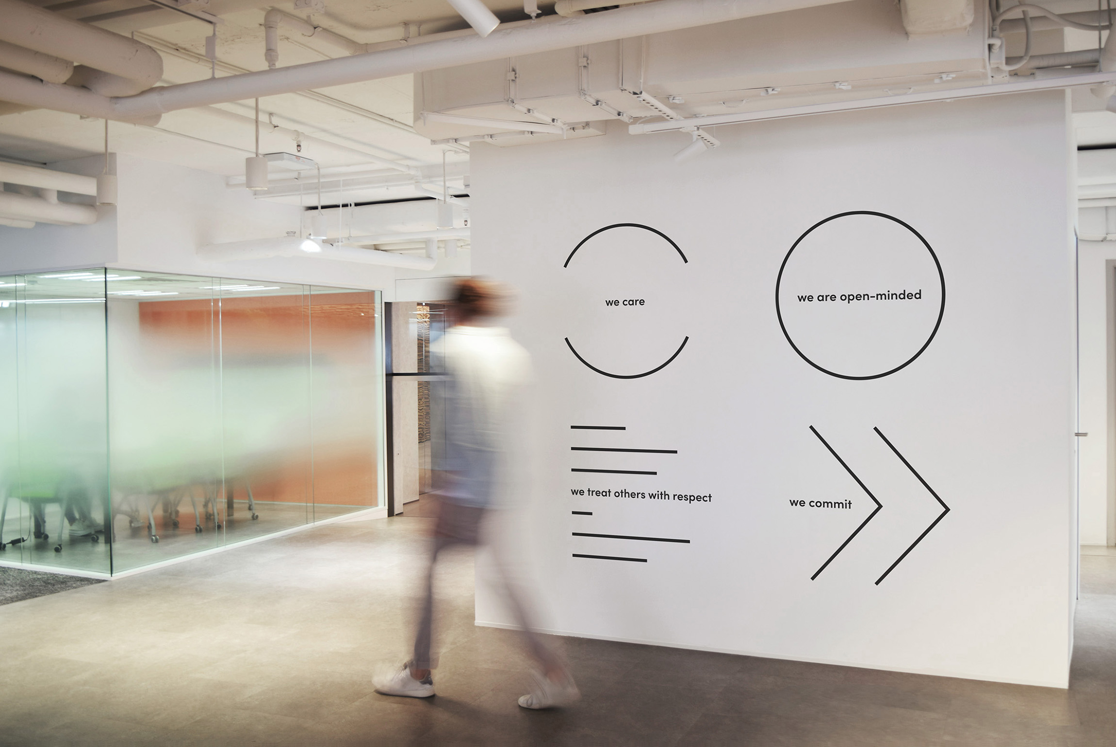
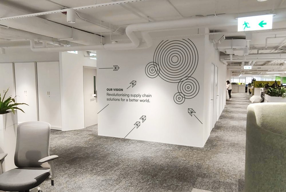
To communicate Oi’s redefined mission and vision, we created a graphic language featuring clear and simple line graphics that effectively capture the core of the updated statements. These prominent wall graphics consistently convey the revised mission and vision to employees, ensuring they grasp the changes and their impact.


Experience the power of
authentic design.
NUX Hamburg
Kristina Düllmann
moin@nux-design.com
+49.(0)40.43 18 12 68
NUX Gisborne
Susanne Effmann
kiaora@nux-design.com
+64.(0)21.154 5824
© NUX Design, 2025 | Imprint | Data protection