Corporate Design
Digital Design
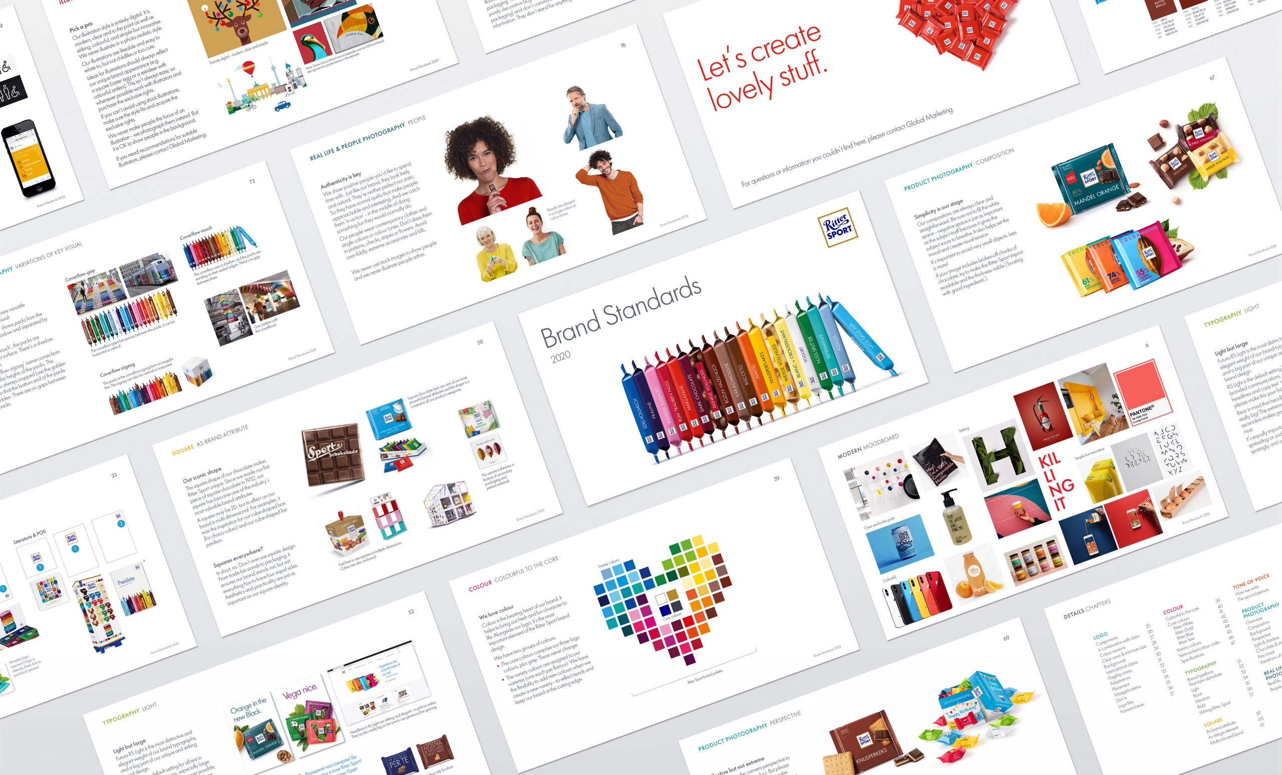
Corporate Guidelines
Icon Design
What makes Ritter Sport unique? To address a growing product portfolio and international activities, we collaborated with the esteemed chocolate maker’s marketing team on a brand project. Together, we analysed the visual identity, defined brand directives, launched a brand book, restructured guidelines and refined design elements.
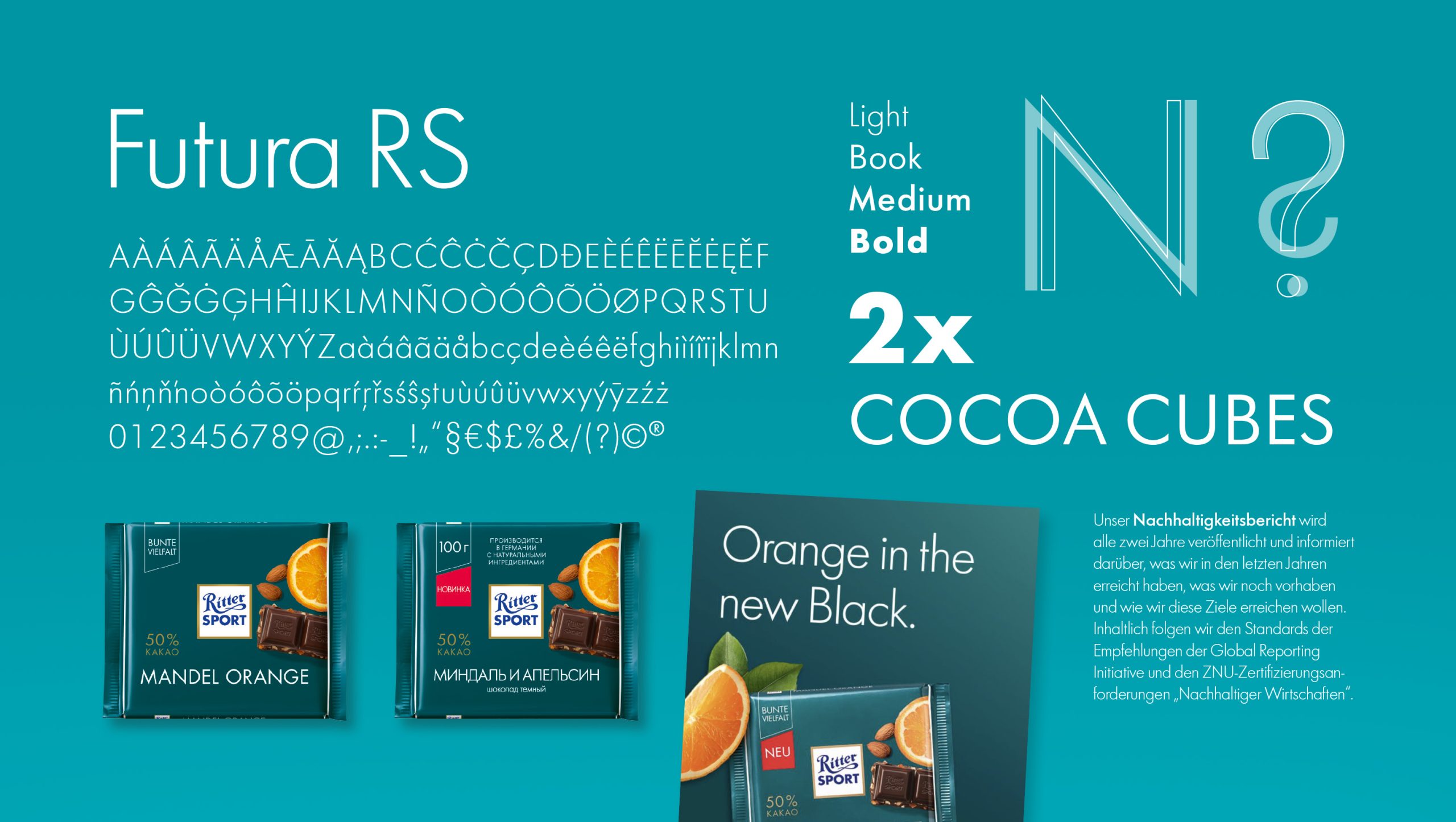
The focus of our work was the development of a clear and unobtrusive visual identity. The new wordmark is simple but straightforward. Lowercase letters and the connection of the two «t» allude to the origin from the Otto Group. White and anthracite dominate, with individual accents set by a new bright green tone.
The abbreviation «Oi», known to customers and suppliers for years, is also visually integrated into the appearance.