Corporate Design
Packaging
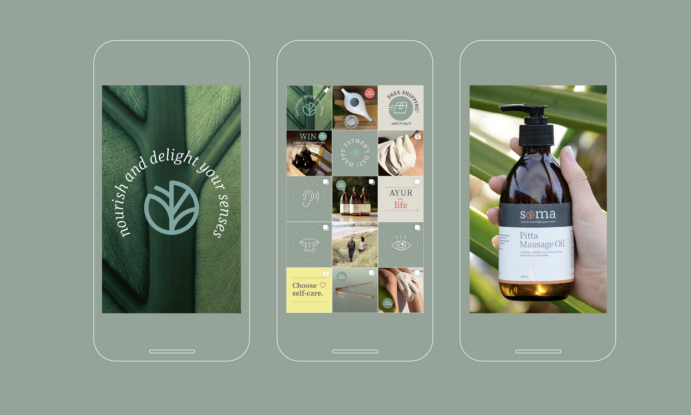
Digital
Branding for Soma – a startup for Ayurvedic wellness products, aimed at rejuvenating and awakening your senses in New Zealand. All products are environmentally friendly and reflect their values of wellness and sustainability.
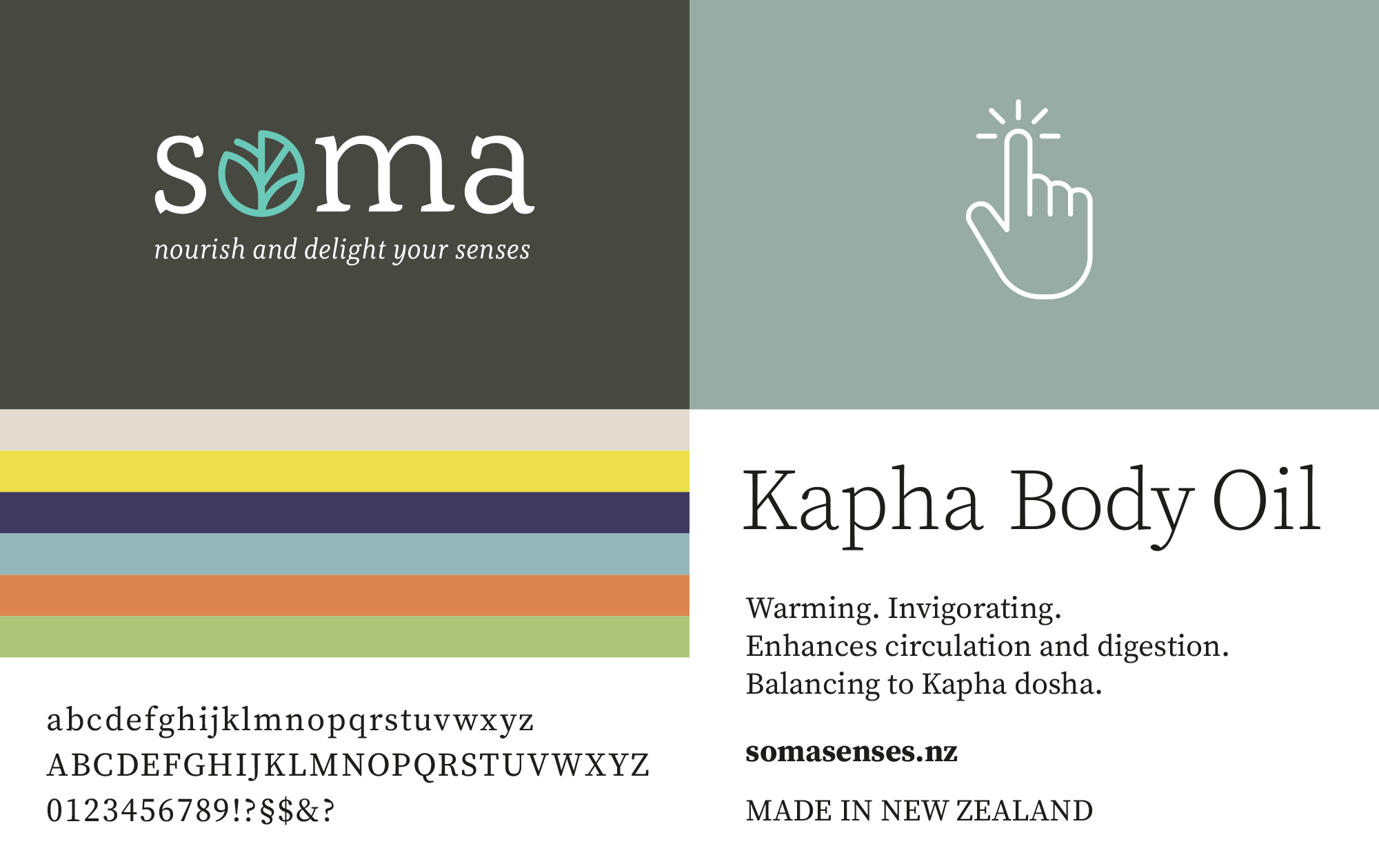

The focus of our work was the development of a clear and unobtrusive visual identity. The new wordmark is simple but straightforward. Lowercase letters and the connection of the two «t» allude to the origin from the Otto Group. White and anthracite dominate, with individual accents set by a new bright green tone.
The abbreviation «Oi», known to customers and suppliers for years, is also visually integrated into the appearance.